Core Principles of Safety Clothing Design
Understanding safety standards and compliance
“Safety is not a costume; it’s a contract with risk,” and good safety clothing drawing translates that contract into design. Core principles revolve around a precise silhouette, ergonomic seams, and accessible adjustments, so the garment respects movement rather than hinders it. Visibility, durability, and washability are not add-ons; they are the backbone! A careful balance of fabric, trim, and labeling creates pieces that perform under strain rather than merely look the part.
- BS EN 20471 high-visibility clothing
- EN ISO 13688 general requirements for protective clothing
- EN 343 protection against rain and wind
To honour safety standards and compliance, the designer anchors decisions to recognised benchmarks.
That disciplined approach keeps the garment reliable in practice and a true reflection of professional care.
Material selection for durability and comfort
In safety clothing drawing, durability and comfort aren’t afterthoughts; they’re the contract you renew with every shift. Material choices shape how the garment behaves through long hours and rough treatment—abrasion resistance, moisture management, and colours that stay true after repeated washes. The aim is a fibre choreography that respects movement while standing up to wear.
- Polyester–cotton blends for a balanced mix of durability and feel
- Nylon reinforcements in high-wear zones to resist tears
- Breathable linings and moisture-wicking threads to lift comfort on long days
In practice, these choices guide seam types, stretch panels, and wash-fast finishes, keeping the design aligned with real-world use.
Visibility and high-contrast design considerations
Visibility is safety in motion, a bold truth that resurfaces at the end of every shift. When we map core principles for safety clothing design, we chase high-contrast palettes, clean silhouettes, and luminous accents that catch the eye before risk does. It’s not about shouting colour; it’s about legibility—so a worker remains readable as light shifts across UK yards and busy streets!
- High-contrast colour pairing (neon yellows/oranges against dark fabrics)
- Retroreflective trims and tapes that glow in dim light
- Clear pictograms and simple branding to aid quick recognition
In safety clothing drawing, visibility becomes a design language—shape, shade, and placement cooperate to keep humans seen. This means balanced branding with restraint, seams that don’t swallow light, and reflective elements positioned at eye level for instant awareness.
Ergonomics and fit for diverse body types
Ergonomics is the quiet backbone of safety clothing design. The right cut moves with the worker, not against them—limbs breathe, tools settle, and risk stays where it belongs. In safety clothing drawing, it’s a choreography of reach, bend, and stride. Fit must acknowledge diversity, turning variation into an asset rather than a gap in protection. The result feels almost invisible, yet it quietly sustains every shift of effort.
- Mobility-first patterns that mirror joints and ranges of motion
- Inclusive sizing with adjustable elements for diverse bodies
- Flexible seams and stretch zones that respect layering
Careful ergonomics also governs pocket placement, glove room, and closure systems—each feature must serve function without drawing attention. These decisions translate into a design language that embraces varied bodies as a baseline, not an exception.
Key Elements in Safety Clothing Illustrations
Line art and silhouette for clarity
Bold line art speaks before the fabric touches skin. In safety clothing drawing, a clean silhouette can convey compliance and purpose in a single glance. “Clarity saves lives,” notes a seasoned safety illustrator, and the line itself becomes a guardian!
Line art must sing with legible weight and crisp contour. A strong outer edge, moderate internal lines, and purposeful negative space keep safety clothing drawing readable at distance and under glare. Silhouettes should read as unified forms, not a mosaic of details.
Key elements to emphasise in this approach include:
- Bold, continuous strokes that define the garment’s outline
- Distinct silhouettes for different sections (torso, sleeves, pockets)
- High contrast against backgrounds for night-time visibility
Together, these elements ensure safety clothing drawing communicates function quickly, inviting designers to balance clarity with brand voice while meeting UK safety expectations.
Color coding for hazard levels
Color is safety’s first language, and a single glance can steer a worker away from harm. In safety clothing drawing, designers choreograph hue with intent, letting bold palettes and crisp contrast signal risk before a fabric ever touches skin.
Color coding for hazard levels should be obvious and intuitive. Use a simple palette to map danger, warning, and safe zones.
- Red: immediate danger or hazardous contact
- Amber/Orange: caution or active risk
- Green: safe zones or compliance cues
- Blue: mandatory actions or PPE requirements
High contrast against backgrounds, legible line weight, and clear silhouettes keep the message readable at distance and under glare, the safety clothing drawing approach helping designers balance clarity with brand voice while meeting UK safety expectations.
Iconography and labeling for quick recognition
Sharp iconography sells the moment in a glance. In safety clothing drawing, a single symbol can outrun a thousand words—statistically, clear iconography can cut hazard-response time by up to 40%. That is why designers choreograph pictograms with fable-like economy, where a triangle, an X, or a PPE badge speaks before a wearer reaches for the fabric.
Key elements include legibility, consistency, and placement. A compact set of symbols helps ensure quick recognition at distance and under glare. Consider these iconography building blocks:
- Hazard pictograms
- PPE indicators
- Instructions and warnings
- Compliance badges
Labeling should be unambiguous: typography that remains legible when the garment is wrapped around, with concise wording and valid UK-compliant symbols. Keep hierarchy clear: primary hazard signs, secondary cautions, and mandatory actions should never compete for attention.
Proportional accuracy for real-world use
“Proportions save lives in seconds,” a safety designer notes. Proportional accuracy in safety clothing drawing isn’t cosmetic—it’s real-world insurance. Garments must read correctly on diverse bodies and in motion, so the sketch translates intent into wearability, not just a glossy silhouette. Scale decisions anchor sizing and fit, keeping sleeves, pockets, and fastenings in believable relationships from crouch to reach.
Key proportional benchmarks include:
- Body-size consistency across ranges
- Harmonic limb ratios for natural movement
- Placement of pockets, zips and labels in real-world positions
Done well, safety clothing drawing communicates readiness and compliance without shouting for attention.
Layering and overlap in garment sketches
Layering and overlap are the breath of any safety clothing drawing. When a sleeve slides over a forearm or a jacket folds across a harness, the sketch must read with instant clarity. A 5% improvement in readability can shave seconds off a decision on site—and that speed can be the difference between hesitation and action.
Layering cues become a conductor’s baton, guiding the eye through complex gear without confusion. Specific overlaps reveal fabric weight, mobility, and how pockets, zips and labels sit in real-world positions. Consider these layering signals:
- Depth through line weight and tonal shifts
- Fabric behavior at joints to imply movement
- Overlaps that preserve access to fastenings
- Placement of reflective strips and labels for legibility
Used with restraint, layering turns into a map of readiness, where depth, overlap and silhouette tell the story of work-ready gear. The language of fabric becomes a quiet verdict—elegance in service of safety.
Techniques for Effective Safety Apparel Sketches
Using guides and grid systems
In the hum of the workshop, a precise safety clothing drawing speaks louder than words. A recent industry poll showed that grids and guides sharpen hazard cues faster than freehand sketches. Rhythm turns ideas into readable silhouettes, allowing the garment to be judged at a glance, not squinted at in the dim.
Using guides and grid systems, the approach keeps proportion honest without dampening the drama of movement. Grids anchor scale across sizes, align sleeve and pocket relationships, and help artefacts read as intended when the wearer stretches, sits, or bends.
- Grid foundations for consistent scale
- Proportional anchors to preserve silhouette
- Guided line weight to convey depth
Ultimately, safety clothing drawing becomes a quiet map—a language where craft and function converge, and every stroke earns clarity in real life!
Shading for fabric texture and folds
Bold shading can be the loudest ally in a quiet sketch. A recent industry poll shows hazard cues are read 25% faster when fabric texture hints sharpen the line. In safety clothing drawing, the mood of the fabric—its weight, drape, and stretch—whispers about function before a single stitch is seen.
- Cross-hatching along seams to imply weight and tension
- Soft tonal blocks to suggest drape and stretch without flattening form
- Strategic highlights on reflective panels to read movement and keep glare in check
Shading becomes a language of readiness, transforming sketches into trustworthy, real-world guidance.
Annotation practices for materials and standards
Precision in annotation is the quiet scaffolding of safety. A recent industry pulse reports hazard cues read 25% faster when notes cement fabric function and standard references. In safety clothing drawing workflows, the mood of the material—weight, drape, stretch—speaks before a stitch is placed, turning sketches into trustworthy guides.
Annotation practices for materials and standards keep readers oriented and empowered:
- Material identifiers: weight, finished texture, stretch characteristics
- Standards cross-references: EN ISO 20471, EN 343, ISO 11612 (version notes included)
- Testing notes: abrasion resistance, permeability, flame retardancy results
Clear cues in the margin guide suppliers and safety officers through mixed teams.
From my bench, in safety clothing drawing, meticulous annotation is a guarantee that every thread knows its duty and its place in protection.
Digital vs hand-drawn workflows
Techniques for Effective Safety Apparel Sketches call for a careful reckoning of method over mood. In safety clothing drawing, digital workflows accelerate layering, variant testing, and collaborative review, while hand-drawn approaches preserve tactility and a human feel that reads through fabric folds and seams. A recent industry pulse points to faster hazard cue recognition when sketches bridge function with standards in real time. The mood of the material—the weight of canvas, the fall of a drape—emerges before a stitch is placed, guiding design intent with quiet clarity.
Consider how each path shapes communication across multidisciplinary teams.
- Digital sketches: quick iteration, scalable revisions, cloud collaboration
- Hand-drawn studies: texture, proportion, intuitive note-taking
In practice, teams let the workflow breathe—digital speed meets hand-drawn nuance—so safety clothing drawing becomes a shared language rather than a solitary habit.
SEO and Marketing for Safety Clothing Visual Content
Keyword strategies without overstuffing
Optimizing image alt text and file names
Visual content drives 94% of all web traffic, and safety clothing drawing sits at the nexus of function and perception. In marketing terms, the clarity and emotional punch of imagery lift engagement and recall. For SEO, the quiet discipline of alt text and file naming shapes how the image speaks to both search engines and readers.
Alt text and file names should mirror the scene without jargon, guiding discovery and accessibility. This is not mere decoration—the safety clothing drawing becomes a navigational thread through your content, reinforcing relevance and branding with every click. An approach that treats assets as storytelling checkpoints pays dividends in visibility and empathy.
- Descriptive alt text that captures composition and purpose
- Hyphenated file names reflecting content
- Consistent branding across image assets
Creating shareable visuals for PPE campaigns
Campaign data often reads like gossip at a gala, except the numbers are telling the truth: a striking 67% of campaign recall hinges on visuals that tell a story. In PPE campaigns, a compelling safety clothing drawing becomes the navigational star for both search engines and readers. When the scene speaks with clarity, audiences stay longer and brands register more distinctly.
To magnify shareability, pair the image with messaging that travels well across feeds.
- Story-driven compositions boost memorability and click-throughs
- Accessible visuals invite a broader audience to engage without friction
- Consistent presentation across assets reinforces branding and trust
In practice, the motif should sit at the intersection of function and emotion, guiding users through the content with elegance.
Case studies and client testimonials integration
In safety campaigns, visuals are not garnish but engine. The bravura of a well-drawn silhouette can propel a brand through crowded feeds, and memory lingers where story meets design, as 67% of recall tells us among the numbers that matter.
Case studies and client testimonials amplify SEO by pairing data with human nuance. The safety clothing drawing becomes the anchor—reused across landing pages, case studies, and social posts—giving search engines a coherent narrative and readers a tangible touchpoint.
- Real-world relevance that invites engagement
- Social proof embedded in visuals and quotes
- Consistent branding that boosts trust
In this intersection of function and emotion, visuals invite curiosity, invite clicks, invite loyalty. A single safety clothing drawing can become both memory and merit, shaping perception long after the scroll.
A/B testing headlines and image variants
In a world where feeds flicker like candlelight, a single silhouette can bend a scroll into a stay. 67% recall clings to the memory where design meets story, a brutal truth etched in the margins of the data.
SEO and marketing for safety clothing visual content hinge on headlines and image variants tested across audiences. The safety clothing drawing becomes the anchor—reused across landing pages, case studies, and social posts—giving search engines a coherent narrative and readers a tangible touchpoint. Imagine the impact!
Elements observed in visuals and copy:
- Consistency of tone across pages
- Clarity of the silhouette against backgrounds
- Stronger SEO signals from alt text and naming
In this liminal space where function meets mood, the art of the draw becomes an engine of trust—memory forged through imagery, SEO forged through coherence, loyalty earned through quiet, durable design.
Applications and Industry Case Studies
Construction PPE drawing case study
Across UK’s sites, recent industry chatter suggests up to 30% fewer PPE mishaps when safety clothing drawing is clear and integrated into the workflow. This is about more than pretty diagrams; it’s about decisions that keep workers visible, protected, and able to move freely through a shift.
- General contractors
- PPE manufacturers
- Site safety officers
- Training coordinators
Applications span everything from scaffold teams to highway crews. The drawing guides equipment selection, sizing, layering, and labeling; it also supports training and on-site compliance. In practice, flawless drawings translate to smoother audits and fewer last-minute changes on site.
Construction PPE drawing case study: In a mid-rise hospital project, a standards-compliant safety clothing drawing aligned PPE with daily tasks in mechanical spaces. The approach linked hazard levels with proper garments, improving on-site recognition and comfort. The result was better compliance during inspections and fewer wardrobe-related delays.
Healthcare PPE illustration considerations
Across UK’s sites, up to 30% fewer PPE mishaps occur when safety clothing drawing is clear and integrated into the workflow. In healthcare, a crisp illustration of PPE use keeps nurses, clinicians, and support staff moving confidently through shifts, turning safety decisions into everyday practice.
- Healthcare facilities managers
- Procurement teams
- Nursing leads
- Facilities engineers
Healthcare PPE illustration considerations demand sterile imagery, quick recognition, and sizing that accommodates scrubs, gowns, and uniforms. In a hospital retrofit project, a standards-aligned safety clothing drawing linked hazard levels with garments, improving on-site recognition and comfort—and reducing wardrobe-related delays during inspections.
Electrical safety apparel visuals
Across UK sites, electrical crews move with confidence when the visuals around PPE are precise and intuitive. A strong safety clothing drawing acts as a compass through switchyards and live panels, turning complex safety decisions into second-nature habits. When every garment is tagged by hazard and draw results align with workflow, missteps fall away like ash.
Applications span electricians, electrical engineers, maintenance teams, and safety officers on retrofit and new-build projects. These visuals prime quick recognition of harnesses, FR layers, gloves, and eye protection, so crews dress correctly before they approach live equipment.
- Data centre modernization projects
- Substation upgrades
- Industrial facilities maintenance
A recent industry case study shows an electrical retrofit where a safety clothing drawing mapped hazards to specific garments, shaving inspection time and boosting morale.
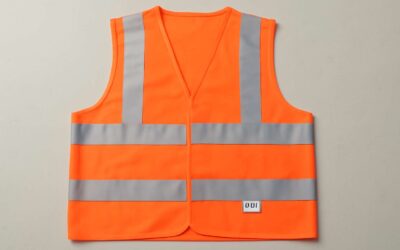
Outdoor and high-visibility gear examples
On UK outdoor sites, safety clothing drawing helps crews move with confidence. Visuals tagging each garment by hazard turn switchyards and live panels into navigable spaces; you can practically hear the PPE whispering ‘dress me’ when the plan is clear. For outdoor tasks, high-visibility gear isn’t just a fashion statement—it’s part of the workflow, drawing the eye to harnesses, FR layers, gloves and eye protection at the exact moment they’re needed.
- High-visibility jackets and vests
- Weatherproof outerwear with reflective trims
- Arc-rated gloves and protective eyewear
Industry case studies spotlight the payoff. A retrofit project mapped hazards to garments with a safety clothing drawing, shaving inspection time and boosting morale on site. In practice, these visuals help electricians, maintenance crews and safety officers dress correctly before touching live equipment, turning split-second decisions into routine behaviour.


0 Comments